
Did you know that the Pantone color for 2026 is… white?

Updated: Sep 13
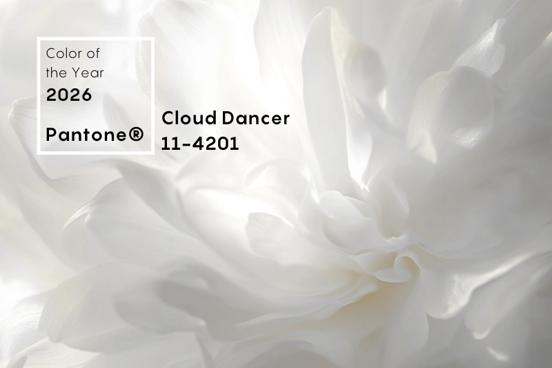
They called it Cloud Dancer.
Officially, it's a soft and soothing shade:
A vaporous white, a symbol of calm, clarity and tranquility in a world that moves too fast.
For Pantone, it's a blank canvas, a minimalist breath: a space where the eye can breathe and where ideas can emerge.
But many designers are not convinced: too neutral, difficult to consider as “the color of the year”. Some have even burned their color charts!
Others see it as a choice out of cultural or social context, and have reacted with humor or skepticism.
I love white.
There is nothing more chic and elegant, and even if you think all whites look alike… that’s wrong!
A white is never chosen on its own: it is decided within a palette designed to last.
There are so many shades to explore: cream, ivory, arctic, snow, pearly, linen, eggshell, milk, smoky… and even pearl white or silk white. So, let's celebrate white!
Each shade has its own personality, and it changes the perception of light, volumes, and atmosphere.
The contrast with Mocha Mousse, the 2025 colour, is striking. |


